Art direction
& photography
Sjöman Partners
January 2024–PresentSince January 2024, I have led the creative work at Sjöman Partners, spanning art direction, design, photography, 3D and motion. From the visual identity to everyday communication and physical objects, the work builds a consistent world around the brand.
Visual identity
The identity balances precise typography and a restrained layout with warm neutrals and tactile materials. Everett brings a clear, contemporary voice to headlines and body text, while the S/P monogram carries the identity into smaller details, surfaces and motion.

The primary signature

S + P / A symbol with the shape of a key
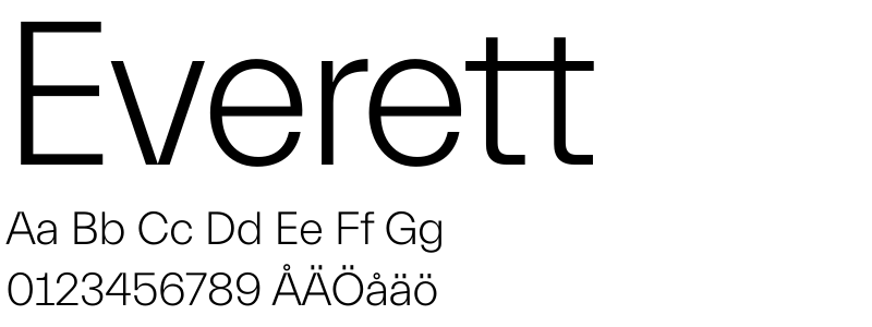
LightLarge headlines
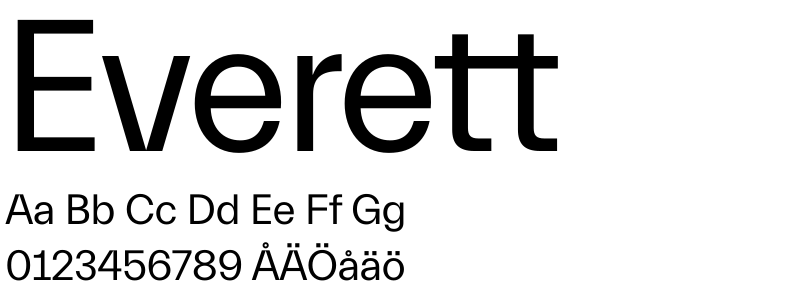
RegularHeadlines & body text
Warm neutrals / Restrained accents
Photography & film
Stockholm, observed through its streets, architecture and quieter details. My photography brings a sense of place to the brand, with warm light and close attention to everyday scenes.
Mellan Visningar
An editorial film pilot built around observations from the office: shifting light, familiar rooms and the small rituals between viewings.
Print & packaging
The identity in the hand: a folded property prospect and a presentation set. Typography, image placement and tactile details carry the same visual language into print.
Property prospect
A gatefold format brings photographs, key information and the floor plan into one compact piece. The folded visualisation uses the original print artwork. My role: layout and graphic design.
Presentation packaging
The identity becomes something to hold: a presentation set combining a satin sleeve, warm paper and printed details. The large monogram is blind-embossed into the paper, letting light and texture define the mark without contrasting ink. Shown as a 3D visualisation.
3D & motion
The identity explored through light, material and movement. Repeating monograms become a glass-like composition; an anniversary film brings sculptural form and animated typography together.
Selected motion
Short films for the brand’s expansion, new office and identity launch. Animated maps, typography and photography give each announcement its own rhythm within a consistent visual language.
Seasonal campaigns
Seasonal changes give the identity a different rhythm. The 2026 work explores light, everyday details and the rituals of summer; the 2025 campaign takes familiar brand objects into unexpected landscapes.
Spring & summer / 2026
Moving shadows frame the monogram for spring, followed by a midsummer film built around flowers, gathering and light. The summer series “Tyst, men inte stängt” turns to the quieter office: a coffee cup left on a desk, an open window and small signs of life.
Summer campaign / 2025
The office moves outdoors for a Swedish summer. Business cards, presentation packaging and a familiar desk appear in unexpected landscapes, connecting everyday brand objects with the season. Created through 3D and generative imagery.
Objects & material studies
Further explorations of the identity through scent, form and material. The metal objects are ongoing R&D, shown as development studies rather than finished products.
Candle concept
An exploration of scent as a brand object. Brushed-metal vessels carry the monogram in relief, paired with fitted boxes and a matchbook. Shown as a 3D concept.
Metal objects / Ongoing R&D
An incense box with a reversible lid and a cylindrical candleholder explore how a useful object can carry the identity with restraint. The forms, construction and surface treatments are still being developed.
Surface studies
The same tray form compared with blasted, brushed and polished finishes. The final material and finish remain open.